The Complete Guide To Conversion Rate Optimisation

So let’s say you’ve just finished paying your web designer several thousand dollars to build you a new expertly-crafted website and your search engine optimiser has ranked your site on the first page of Google for keywords that have the potential to bring in thousands of new potential customers. Sounds pretty great, doesn’t it?
However, a month passes and you notice you’re not getting as many sales as you had hoped. “Ah, it’s probably just that time of the year”, you say to reassure yourself.
Then another month passes and sales are still lackluster. You berate your SEO and web designer and bombard them with questions, but nobody seems to have an answer. All right, what’s going on here? Well, let me tell you what’s happening: the problem here is that most of us are so focused on what we want our websites to look like that we don’t take what our visitors want into account. This usually results in the above scenario where you have a nice website that ranks well in Google, but your conversion rates are abysmal.
You see, the reason that the search engine optimiser in that scenario didn’t have an explanation for the poor conversions on the website is because SEO is about optimising the technical aspects of your site to increase the likelihood that your website will rank for your desired keywords. However, once those visitors arrive on your landing page, what happens next is no longer the responsibility of the search engine optimiser or the web designer. Instead, this is where conversion rate optimisation (CRO) comes in.
What Is Conversion Rate Optimisation?
Now, what is conversion rate optimisation you ask? Well, CRO is the process of figuring out which designs, images, headlines and call-to-actions (CTAs) will result in the highest nuber of clicks & sales. This is not something an SEO specialist or a web designer can do based on their judgement alone; this is something that you have to test yourself.
At this juncture, you may be wondering what benefits there are when you do CRO with your SEO campaigns. Well, CRO can actually be used to compliment SEO by increasing your conversion rates, leading to more sales than you would normally receive if you had done SEO by itself. But that’s not all, CRO can:
- Be used to write titles that will entice users to click them. This will increase your click-through rate (CTR), which is how many people click on your website’s URL from Google versus the number of people who see it, in the search engine results pages (SERPs). This translates into more visitors to your site.
- Be a great way to find out what your leads respond best to on your website through A/B split testing.
- Be used to find out what how your web visitors are responding to any changes made to your website.
Started In CRO: Call-To-Actions
Before we get into how to AB test, there are two terms you should familiarize yourself with: call-to-actions and landing pages.
- A call-to-action (CTA) is a response you want your visitors to have on your website, usually in the form on a button.
- A landing page is the page your visitors arrive on from your advertisements. This page will contain your call-to-action.
Now, the idea of a landing page in conversion rate optimisation (CRO) is to guide users where you want them to go, which in this case is to your call-t0-action. Note the singularity in the word “call-to-action” as this is where many marketers make mistakes. You see, a good landing page has 1 CTA and 1 CTA only, however some marketers will add multiple CTAs in hopes that users will be more likely to click on one of them due to their increased prevalence on the page.
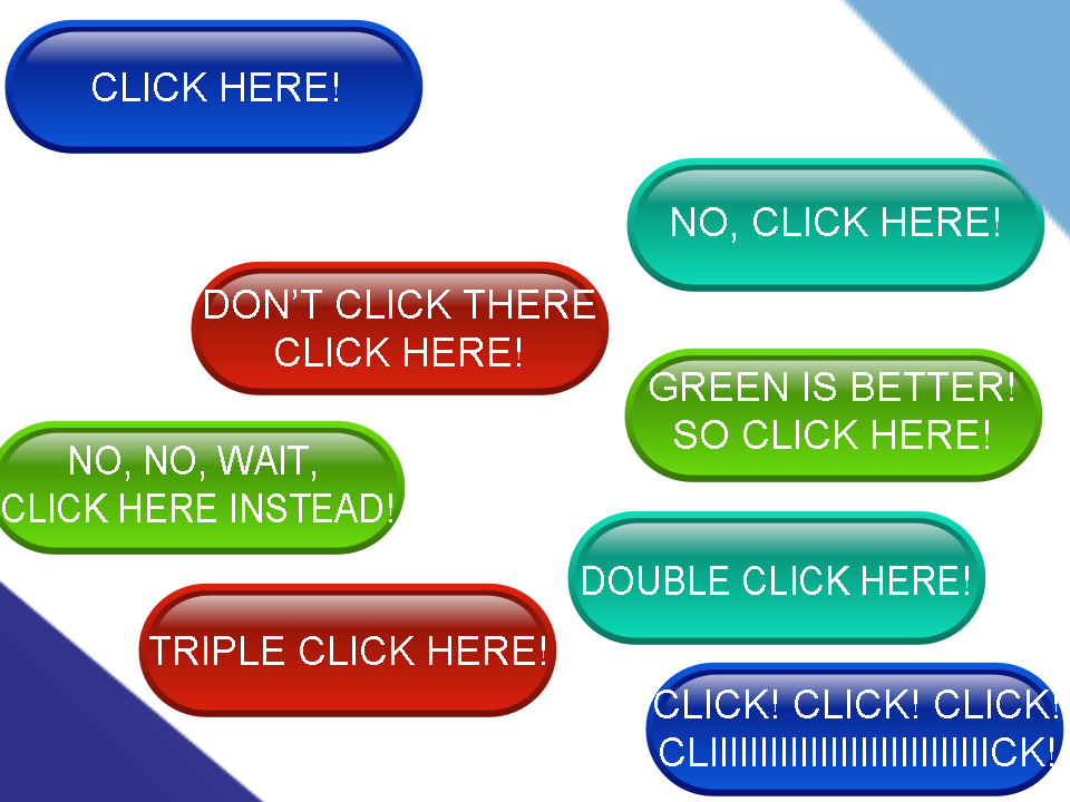
In reality, this shot in the dark, much like an actual shot in the dark, will confuse your site visitors. In fact, this is what a website with more than 1 CTA looks like to the average Internet users.

Do you see the problem now?
Now that you know that you only need 1 CTA on your landing page, it’s time to go over what CTAs look like in more detail.
- Button Form: These are the round buttons featured in the image above. They’re featured on many websites, including Facebook business pages, and are more commonly square or round.
- Link Form: Occasionally, a CTA may be featured as a simple link with a command such as “Click here” or “Sign up now”.
- Written Form: Yes, a CTA can even be written out. An example of this would be text in an advertisement that says, “Call us now at 555-5555”. In some cases, the phone number may have a telephone link to allow mobile users to call directly when they click the link.
How To A/B Split Test & Its Benefits In CRO

A/B testing, split testing, A/B split testing, they all refer to the process of comparing 1 version of a call-to-action (CTA) or another page element (version A) to different version (version B). This process is used in conversion rate optimisation (CRO) to find out which version performs the best. The best version will then be selected while the second version is either discarded or modified for another split test.
Why You Should Start A/B Split Testing
If you’re receiving traffic to your landing page, but notice that your visitors aren’t clicking on your call-to-action, then running an A/B split test will help you find out what your web visitors respond best to. For most websites, there are 3 important elements you should split test:
- Your Logo
- Your Headline
- Your Call-To-Action
The reason these elements are important is because these are the elements which are usually placed above the fold, which is the area of the screen that a user sees without having to scroll down. Both the logo and the headline have an impact on a visitor’s first impression of your landing page and your CTA is what you want them to interact with. Of course, there are other elements you can split test as well, such as the layout or overall design of your website, so don’t feel limited to testing only those 3 elements.
What A/B Split Tests Should You Run?
Below, I’ve compiled a short list of various split tests you can run for your call-to-action.
- Changing the image color of your CTA
- Changing the text color of your CTA
- Changing the text of your CTA
- Changing the shape of your CTA
- Changing the quality of your CTA
- Change your CTA from text to image, or vice verse
- Adding effects to your CTA (e.g., mouse-over)
You would be amazed at how much of a difference these seemingly “small” changes can make to your conversion rate. For example, several months ago I performed an A/B split test for the advertisements on this site. Simply changing the color scheme of the ads brought my measly 0.2% click-through rate (CTR) up to a 1.2%. Further split tests brought this CTR up even further!
- Are The “Rank 1 In Google For Any Keyword” Services A Scam? - April 1, 2025
- OfficeOutlaw.com: Our New Internet Marketing Forum - March 26, 2025
- What You Need To Know Before Using Microsoft Teams - March 24, 2025


Leave a Reply